Building a robust authentication system is a cornerstone of any modern mobile application. In this two-part series, we’ll explore how to implement authentication in a React Native app using Expo Router and TypeScript.
This first part focuses on creating the Home and Register screens and setting up the necessary navigation structure.

1. Setting Up Authentication Layout
To start, we need to define the layout for authentication screens. Modify the auth/_layout.tsx file as follows:
import { Redirect, Stack } from 'expo-router';

export default function AuthLayout() {
  return (
    <Stack>
      <Stack.Screen name="index" options={{ headerShown: false }} />
      <Stack.Screen name="Register" options={{ headerShown: false }} />
      <Stack.Screen name="Login" options={{ headerShown: false }} />
      <Stack.Screen name="OTPVerify" options={{ headerShown: false }} />
      <Stack.Screen name="ForgetPass" options={{ headerShown: false }} />
    </Stack>
  );
}
You can add additional screen definitions to the layout as needed.
2. Creating the Home Screen
The Home Screen introduces users to the app and provides a “Get Started” button.
Code: auth/index.tsx
import React from 'react';
import { View, Text, StyleSheet, Image, TouchableOpacity } from 'react-native';
import { useNavigation, NavigationProp } from '@react-navigation/native';
import { ListAuth } from '@/src/types';
import Logo from '../../../assets/images/icon.png';
import authbg from '../../../assets/images/authbg.jpg';
import Colors from '@/src/constants/Colors';

const HomeScreen = () => {
  const navigation = useNavigation<NavigationProp<ListAuth>>();

  const handlePress = () => {
    navigation.navigate('Register');
  };

  return (
    <View style={styles.container}>
      <View style={styles.backgroundContainer}>
        <Image source={authbg} style={styles.backgroundImage} />
      </View>
      <View style={styles.content}>
        <Text style={styles.heading}>Hey, Welcome to</Text>
        <Image source={Logo} style={styles.logo} />
        <TouchableOpacity style={styles.button} onPress={handlePress}>
          <Text style={styles.buttonText}>Get Started ➜</Text>
        </TouchableOpacity>
      </View>
    </View>
  );
};

const styles = StyleSheet.create({
  container: {
    flex: 1,
    paddingTop: 80,
    alignItems: 'center',
    backgroundColor: 'white',
  },
  backgroundContainer: {
    ...StyleSheet.absoluteFillObject,
    zIndex: -1,
  },
  backgroundImage: {
    flex: 1,
    width: null,
    height: null,
  },
  content: {
    alignItems: 'center',
    zIndex: 1,
  },
  logo: {
    width: 170,
    height: 90,
    marginBottom: 20,
  },
  heading: {
    fontSize: 22,
    fontWeight: 'bold',
    color: Colors.blue.color,
    marginBottom: 5,
    fontStyle: 'italic',
  },
  button: {
    backgroundColor: Colors.orange.color,
    paddingVertical: 20,
    paddingHorizontal: 70,
    borderRadius: 5,
    marginTop: 380,
  },
  buttonText: {
    color: 'white',
    fontSize: 18,
    fontWeight: 'bold',
  },
});

export default HomeScreen;
Notes:
- Add required images (
authbg.jpg,icon.png) to your assets folder. ListAuthdefines type safety for navigation.
3. Handling Image Imports
To handle image imports (.jpg, .png, etc.), create a file named declarations.d.ts in the src folder:
declare module '*.jpg';
declare module '*.png';
declare module '*.jpeg';
declare module '*.gif';
4. Defining Types
Add the following to src/types.tsx to define screen navigation types:
export type ListAuth = {
  Home: undefined;
  Register: undefined;
  Login: undefined;
  ForgetPass: undefined;
  PasswordResetNumber: undefined;
  OTPVerify: {
    name: string;
    phoneText: string;
    password: string;
    email: string;
    otp: string;
    referal: string;
  };
};
5. Setting Up Colors
Define reusable colors in src/constants/Colors.ts:
export default {
  light: {
    orange: { color: '#B95900' },
    blue: { color: '#045081' },
    green: { color: '#037F00' },
  },
  dark: {
    orange: { color: '#B95900' },
    blue: { color: '#045081' },
    green: { color: '#037F00' },
  },
};
Customize the colors as needed for your app theme.
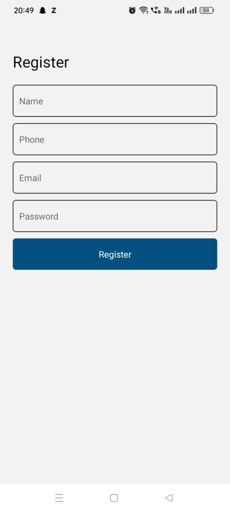
6. Building the Register Screen
The Register Screen collects user details and sends them to the backend.
Code: auth/Register.tsx
import React, { useState } from 'react';
import { View, Text, StyleSheet, TextInput, Alert, TouchableOpacity } from 'react-native';
import { useNavigation, NavigationProp } from '@react-navigation/native';
import { RootStackParamListAuth } from '@/src/types';
import Colors from '@/src/constants/Colors';

const Register = () => {
  const [name, setName] = useState('');
  const [phoneText, setPhoneText] = useState('');
  const [password, setPassword] = useState('');
  const [email, setEmail] = useState('');
  const navigation = useNavigation<NavigationProp<RootStackParamListAuth>>();

  const handleRegister = () => {
    if (!name || !phoneText || !password || !email) {
      Alert.alert('Error', 'All fields are required');
      return;
    }

    const formData = new FormData();
    formData.append('action', 'register');
    formData.append('name', name);
    formData.append('mobile', phoneText);
    formData.append('password', password);
    formData.append('email', email);

    fetch('https://your-api-endpoint.com/register', {
      method: 'POST',
      body: formData,
    })
      .then(response => response.json())
      .then(data => {
        if (data.status === 'success') {
          Alert.alert('Success', 'User registered successfully');
          navigation.navigate('Login');
        } else {
          Alert.alert('Error', data.message || 'Failed to register user');
        }
      })
      .catch(error => {
        Alert.alert('Error', 'Failed to register. Please try again.');
      });
  };

  return (
    <View style={styles.container}>
      <Text style={styles.heading}>Register</Text>
      <TextInput placeholder="Name" value={name} onChangeText={setName} style={styles.input} />
      <TextInput placeholder="Phone" value={phoneText} onChangeText={setPhoneText} style={styles.input} />
      <TextInput placeholder="Email" value={email} onChangeText={setEmail} style={styles.input} />
      <TextInput placeholder="Password" value={password} onChangeText={setPassword} style={styles.input} secureTextEntry />
      <TouchableOpacity onPress={handleRegister} style={styles.button}>
        <Text style={styles.buttonText}>Register</Text>
      </TouchableOpacity>
    </View>
  );
};

const styles = StyleSheet.create({
  container: { padding: 20 },
  heading: { fontSize: 24, marginBottom: 20 },
  input: { borderWidth: 1, padding: 10, marginBottom: 10, borderRadius: 5 },
  button: { backgroundColor: Colors.blue.color, padding: 15, borderRadius: 5 },
  buttonText: { color: 'white', textAlign: 'center' },
});

export default Register;
In the next part, we’ll focus on creating the Login screen, adding OTP verification, and handling authentication states. Stay tuned! 🚀
Very helpful